2. Border Image
The border image extension is an excellent solution to the
problem of creating a dynamically sized rectangle with custom borders.
Its implementation is very similar to CSS Sprites, and usage is simple.
This technique is useful for buttons, titles, content zones, and every
area where we want a custom border design without using tables.
The attribute to use is -webkit-border-image, and the most common
syntax is:
-webkit-border-image: url top right bottom left x_repeat y_repeat;
The url is the image location (or
inline image), and the four edge values (top,
right, bottom,
left) are distance values to be used from the
image’s sides. The center box defined by the space not used by these
four values will be used for the center pattern. For example, if we
define 5 as the top, the box to which
we are applying this style will have as the top border the top 5px of
the border image.
Warning:
The border image doesn’t define the box’s width and height or
the border size; it is only used to define the contents of the border.
If we need to change the dimensions of the box, we need to add
width and height properties. We must also define the
border property of the element,
setting it to the desired size. The border image will be resized to
the border size.
The x_repeat and
y_repeat values are optional and can be
defined as one of the following constants:
repeat
The portion of the image extracted using the
top and
bottom for
y_repeat and using the
left and
right for
x_repeat is repeated until it fills the
available width/height of the box.
round
The image is repeated until it fills the available
width/height of the box, but without any partial tile at the end;
it is stretched so that it fits in the available space a whole
number of times. This value has no effect in many mobile
browsers.
stretch
The image is stretched to fill the entire width or height of
the box without repetition.
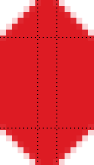
The border image is cut in nine pieces, as we can see in the Figure 1. Four are used as
corners and the others are used as background images for sides and
center.
Warning:
If you are applying a border image to a button, it will not have
any “pressed” effect. To create such an effect, you must change the
active and/or focus pseudoclass, specifying another border
image. Problems can occur when you try to change the way buttons are
rendered dynamically, though, so for custom designs it is better to
use links or remove the default button rendering with -webkit-appearance: none.
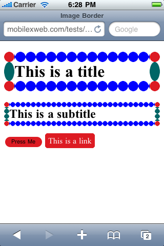
The simplest way to define the border image is with the four
values equal, using:
-webkit-border-image: url distance;
This sample will produce the result shown in Figure 2:
<!DOCTYPE html PUBLIC "-//WAPFORUM//DTD XHTML Mobile 1.0//EN"
    "http://www.wapforum.org/DTD/xhtml-mobile10.dtd">
<html xmlns="http://www.w3.org/1999/xhtml">
<head>
<meta http-equiv="Content-Type" content="text/html; charset=UTF-8" />
<title>Image Border</title>
<style type="text/css">
/* We should use input[type=button] too, but for testing purposes we will
not use CSS3 */
input.bordered {
    -webkit-border-radius: 10px;
    -webkit-border-image: url(border1.png) 6;
}

a.bordered {
    -webkit-border-image: url(border1.png) 6;
    color: white;
    text-decoration: none;
    padding: 3px;
}

h1 {
    -webkit-border-image: url(border2.png) 50 50 50 50 repeat stretch;
    border: 20px;
}

/* The h2 will use the same image border but half size */
h2 {
    -webkit-border-image: url(border2.png) 50 50 50 50 round round;
    border: 10px;
}
</style>
</head>

<body>
  <h1>This is a title</h1>
  <h2>This is a subtitle</h2>
  <input type="button" class="bordered" value="Press Me" />
  <!-- Safari applies border image to inline elements too -->
  <a href="http://mobilexweb.com" class="bordered">This is a link</a>
</body>
</html>
Another sample is the implementation of the classic back button in
iPhone user interfaces, using only left, right, and center zones
(splitting the image into three parts). This code produces the result
shown in Figure 3:
<!DOCTYPE html PUBLIC "-//WAPFORUM//DTD XHTML Mobile 1.0//EN"
    "http://www.wapforum.org/DTD/xhtml-mobile10.dtd">
<html xmlns="http://www.w3.org/1999/xhtml">
<head>
<meta http-equiv="Content-Type" content="text/html; charset=UTF-8" />
<title>Image Border</title>
<style type="text/css">
#back {
    -webkit-border-image: url(border1.png) 0 5 0 15;
}

</style>
</head>

<body>
  <a href="/" id="back">Home Page</a>
</body>
</html>
As Table 2
shows, this extension works on about half of the major mobile web
platforms.
Table 2. Border image compatibility table
| Browser/platform | Block
elements | Inline
elements |
|---|
| Safari | Yes | Yes |
| Android
browser | Yes (differences with
content background) | Yes |
| Symbian/S60 | Partial in
5th edition No before
5th edition | Yes |
| Nokia Series
40 | Bad in
6th edition No before
6th edition | Buggy in
6th edition |
| webOS | Yes | Yes |
| BlackBerry | No | No |
| NetFront | No | No |
| Openwave
(Myriad) | No | No |
| Internet
Explorer | No | No |
| Motorola Internet
Browser | No | No |
| Opera
Mobile | No | No |
| Opera Mini | No | No |
Note:
Some of the WebKit extensions will also work in Firefox Mobile
and in the MeeGo/Maemo browser, because both use Mozilla’s Gecko
engine. For these browsers, we should replace the prefix -webkit with -moz.

3. Safari-Only Extensions
Safari on iOS has added a lot of extensions to the CSS
standards, and even to WebKit (which is the engine behind it). These
extensions work only in Safari for iPhone, iPad, and iPod Touch (some of
them also work in Safari for desktop, but we’re only concerned with
mobile browsers here). The Android and webOS browsers also understand
some of these extensions, depending on which WebKit version they are
based on.
The CSS extensions can be grouped into categories as follows:
The CSS extensions for iPhone are quite spectacular. They allow
you to create Flash-like experiences and 3D transformations using only
CSS. This is great, though also sometimes painful because it all needs
to be coded in CSS, a language not built for this kind of interaction.
Table 3. Common CSS extensions for Safari on iOS
| Property | Values | Description |
|---|
| -webkit-text-security | circle, disc, none, square | Defines the character to
display in password fields for each character the user
enters. |
| -webkit-text-size-adjust | auto, none, percentage value | Defines the font size
adjustment for easy reading. |
| -webkit-appearance | Partial list:
none, button, button-bevel, checkbox, default-button, listbox, listitem, media-fullscreen-button, media-mute-button, media-play-button, radio, searchfield, searchfield-cancel-button, slider-horizontal, slider-vertical, square-button, textarea, textfield | Changes the appearance of
elements to render as native controls of the OS. Available since
iOS 2.0. A value of none will
allow us to define a custom design using CSS. |
| -webkit-user-select | auto / none /
text | From iOS 3.0, defines
whether or not the user can select the text for copy/paste
purposes. |
| -webkit-touch-callout | none, inherit | Removes the callout (hint
window) that appears when the user keeps his finger over a link
for a few seconds. |
| -webkit-tap-highlight-color | Color
value | Defines a color to be
used as the background when the user taps a link or a clickable
element. |